STUDIO 5115

Warming up our GPU...

Editorial Design

Where Flowers Bloom Kit primo e secondo numero della rivista
Where Flowers Bloom Kit primo numero uno della rivista
Dettaglio della rivista where flowers bloom
Copertina della rivista where flowers bloom
Interno della rivista where flowers bloom
Terza edizione del indie magazine where flowers bloom Interno della terza edizione del indie magazine where flowers bloom

Questo progetto editoriale vuole sottolineare la propagazione dell'arte interdisciplinare raccolta in terra ticinese che, nonostante le varie limitazioni geografiche, linguistiche, di risorse e altro, è ricca di giovani artisti di talento che faticano ad affermarsi nel panorama artistico condiviso e riconosciuto anche oltre i confini del cantone. 
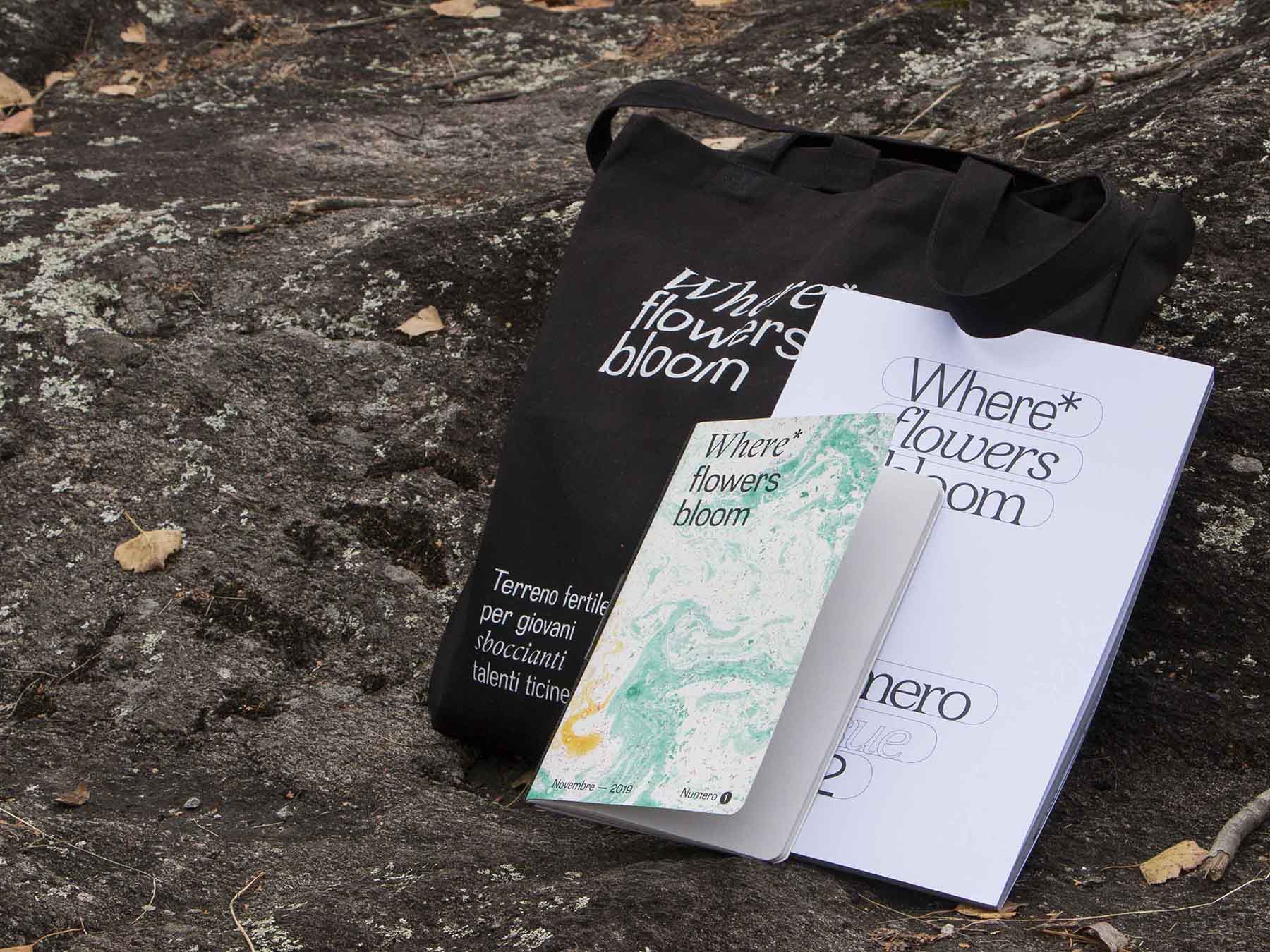
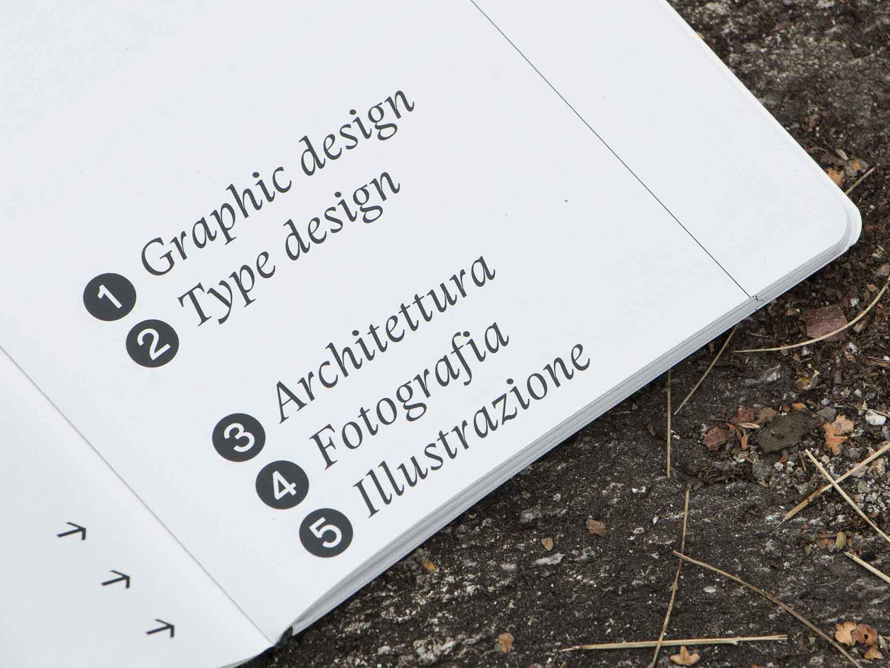
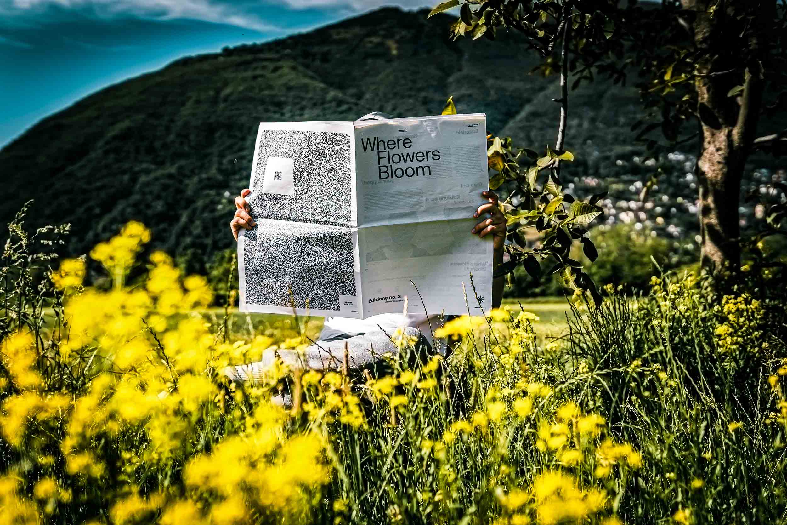
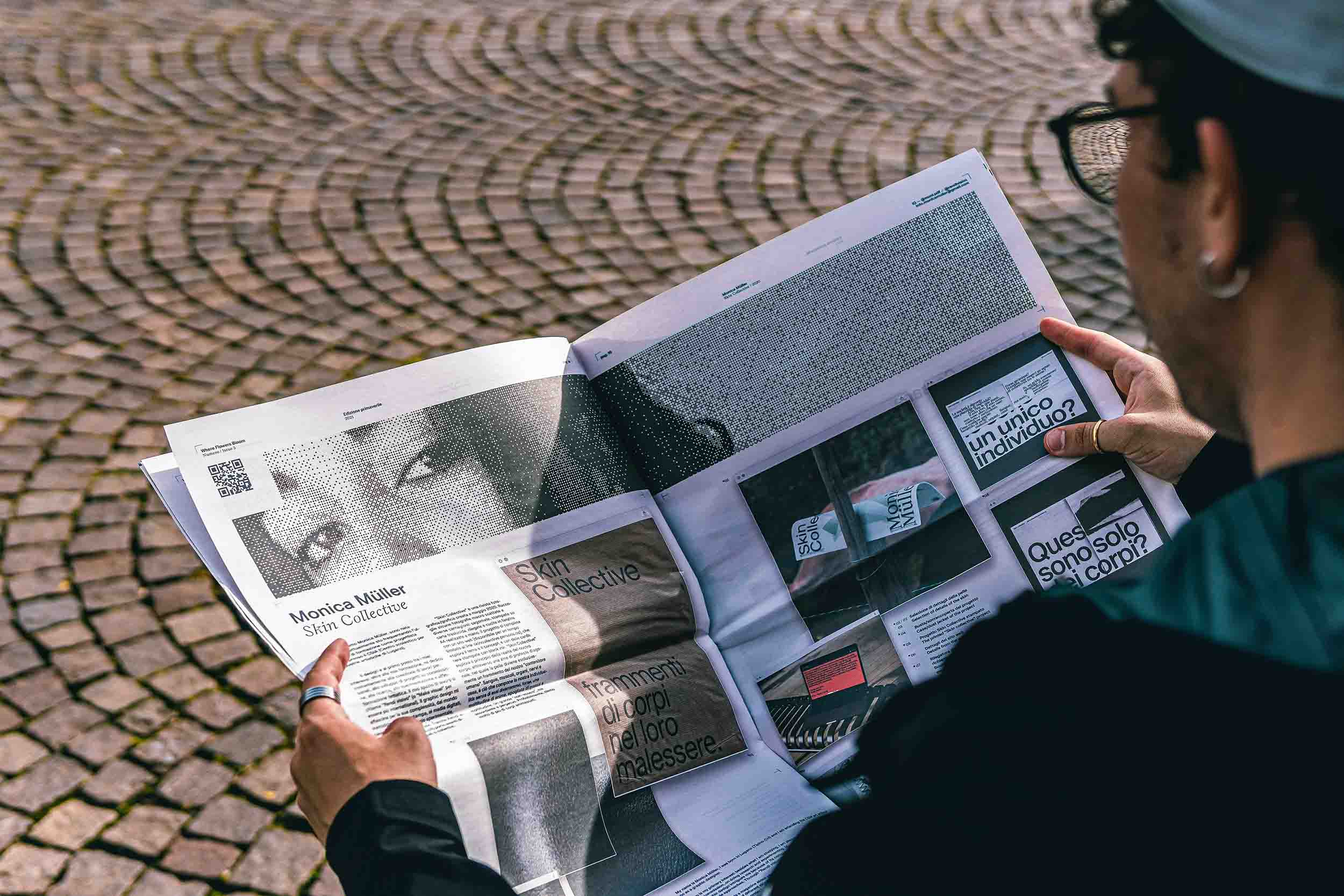
La rivista è un mezzo che può essere utilizzato da tutti, permettendo di mettere in mostra i vari talenti artistici ticinesi. L'obiettivo è quello di far conoscere e 
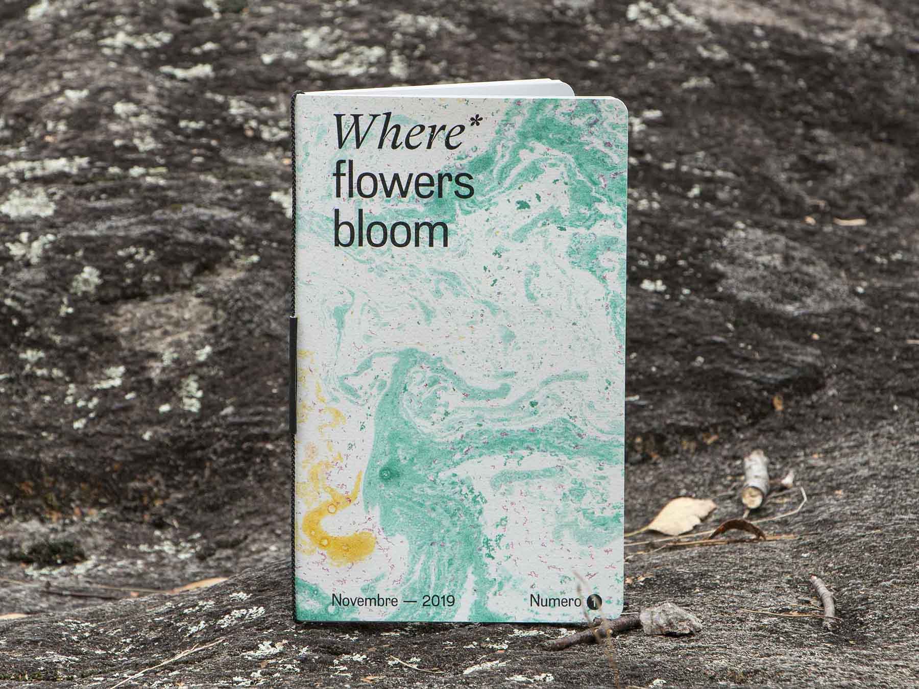
far fiorire nuovi artisti ticinesi emergenti, da qui il nome della rivista. Ogni 
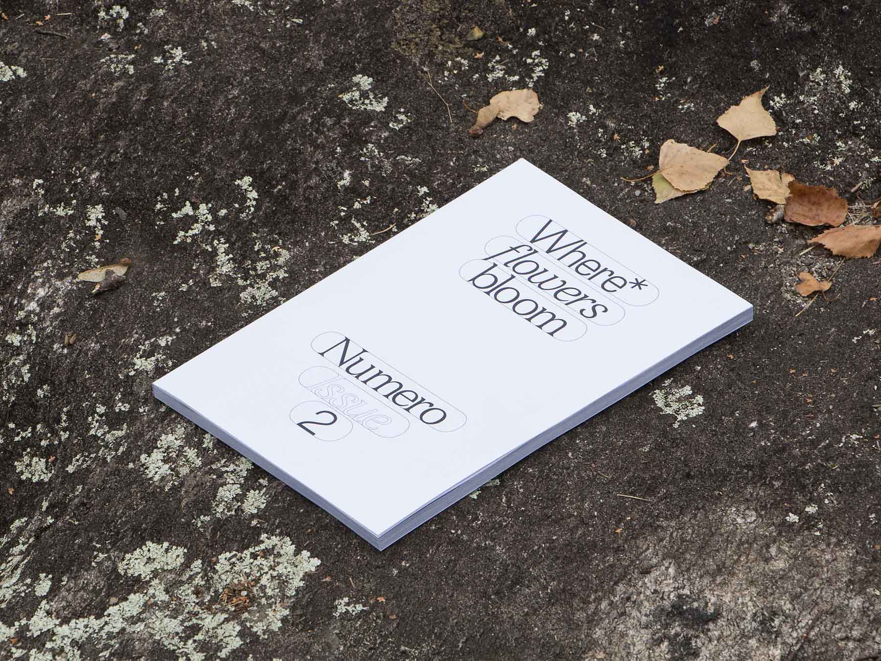
edizione è unica, con grafica, impaginazione, stampa e rilegatura diverse. Al momento sono state pubblicate tre edizioni di Where flowers bloom.
Sito web: wfb-issue.ch

This publishing project aims to emphasize the propagation of interdisciplinary art collected in the Ticino soil, which, despite the various geographical, linguistic, resource and other limitations, is full of talented young artists who struggle to establish themselves in the shared and recognized art scene even beyond the borders of the canton.


The magazine is a medium that can be used by all, allowing the various artistic talents of Ticino to be put on display. The aim is to make new emerging Ticino artists known and flourish, hence the name of the magazine. Each edition is unique, with different graphics, layout, printing and binding. At the moment three editions of Where flowers bloom has been published.
Website: wfb-issue.ch


Font specimen della tesi Normale Grotesk Roberto Schneeberger
Tesi Normale Grotesk Libri grafici
Interno dello specimen del font Normale Grotesk
Interno specimen del carattere Normale Grotesk
Maglietta Normale Grotesk

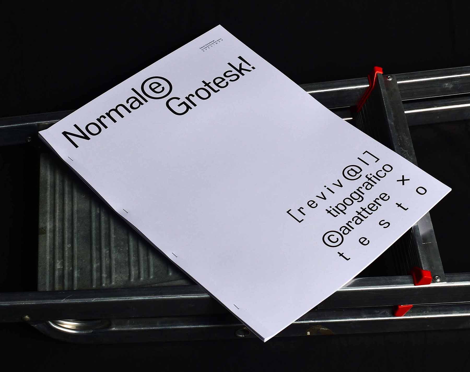
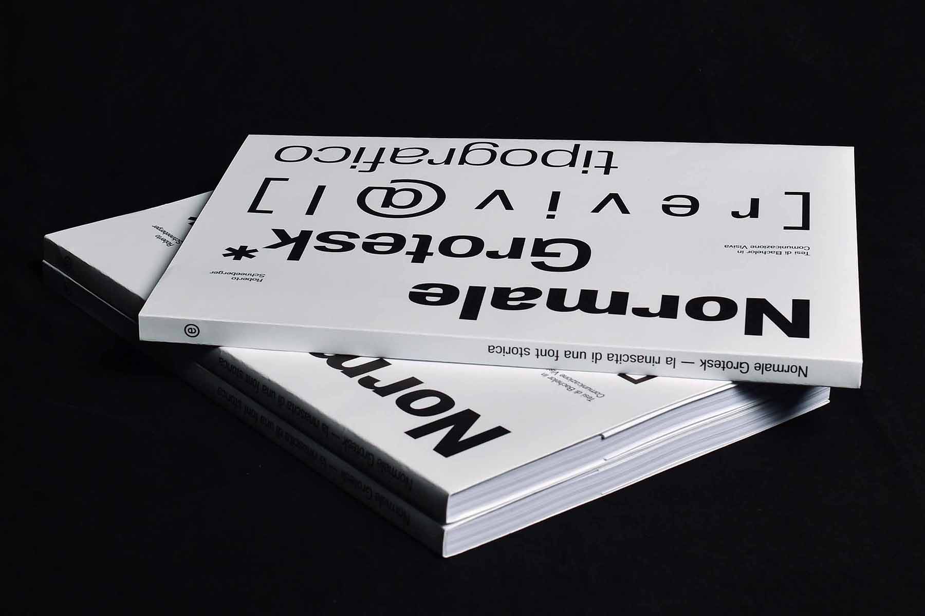
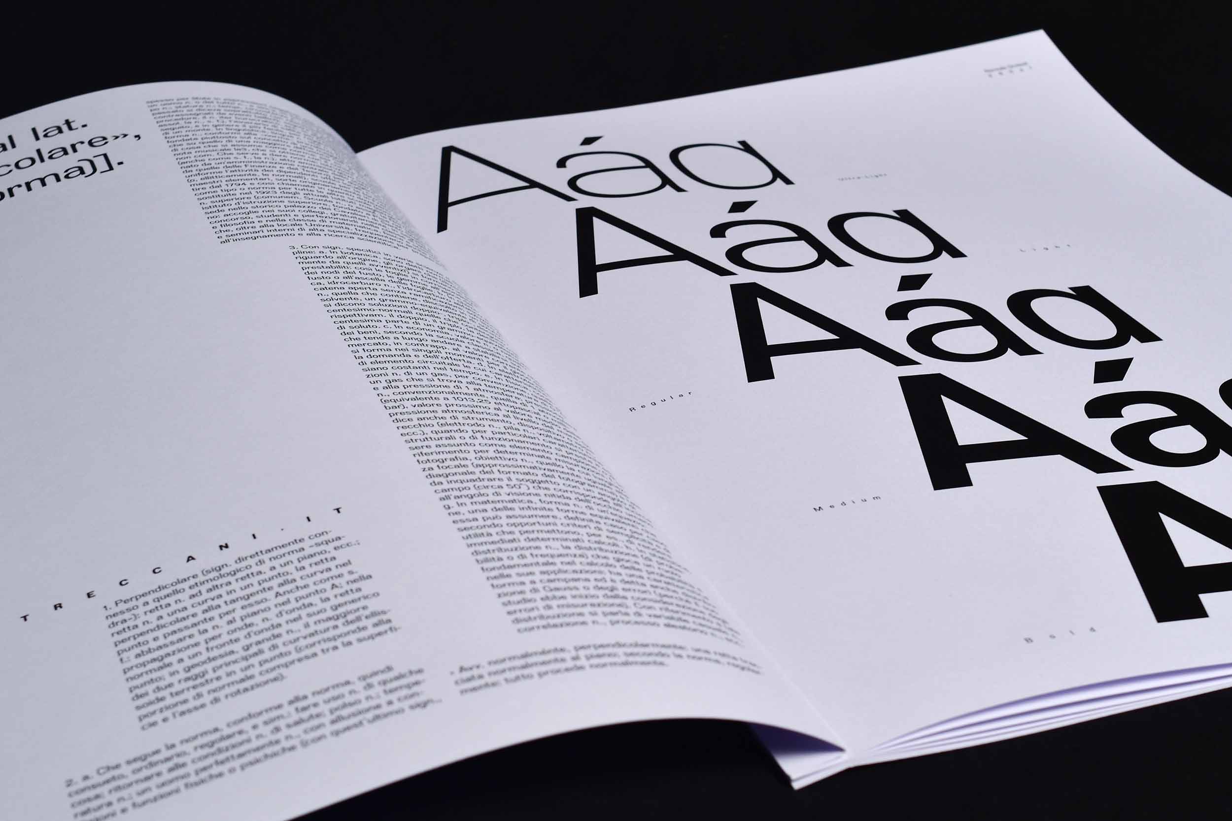
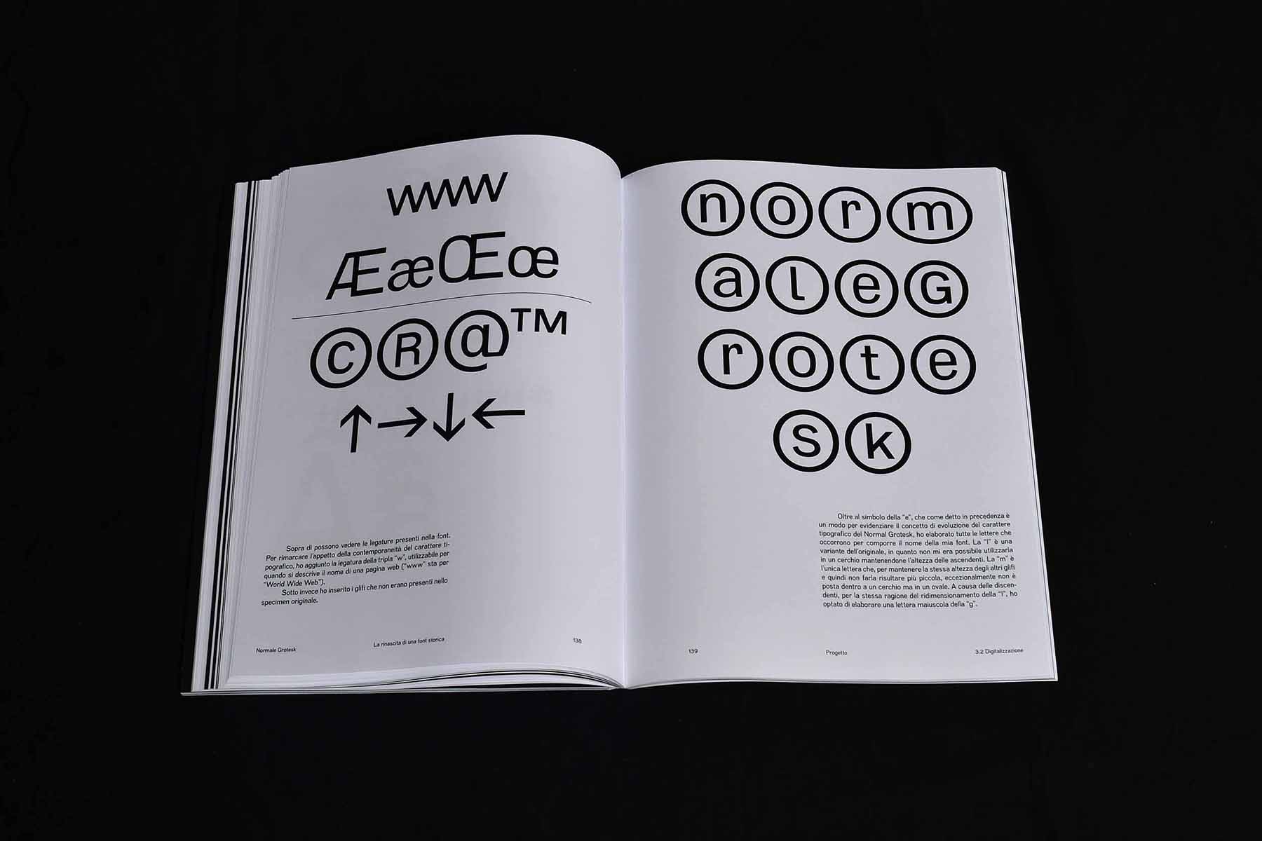
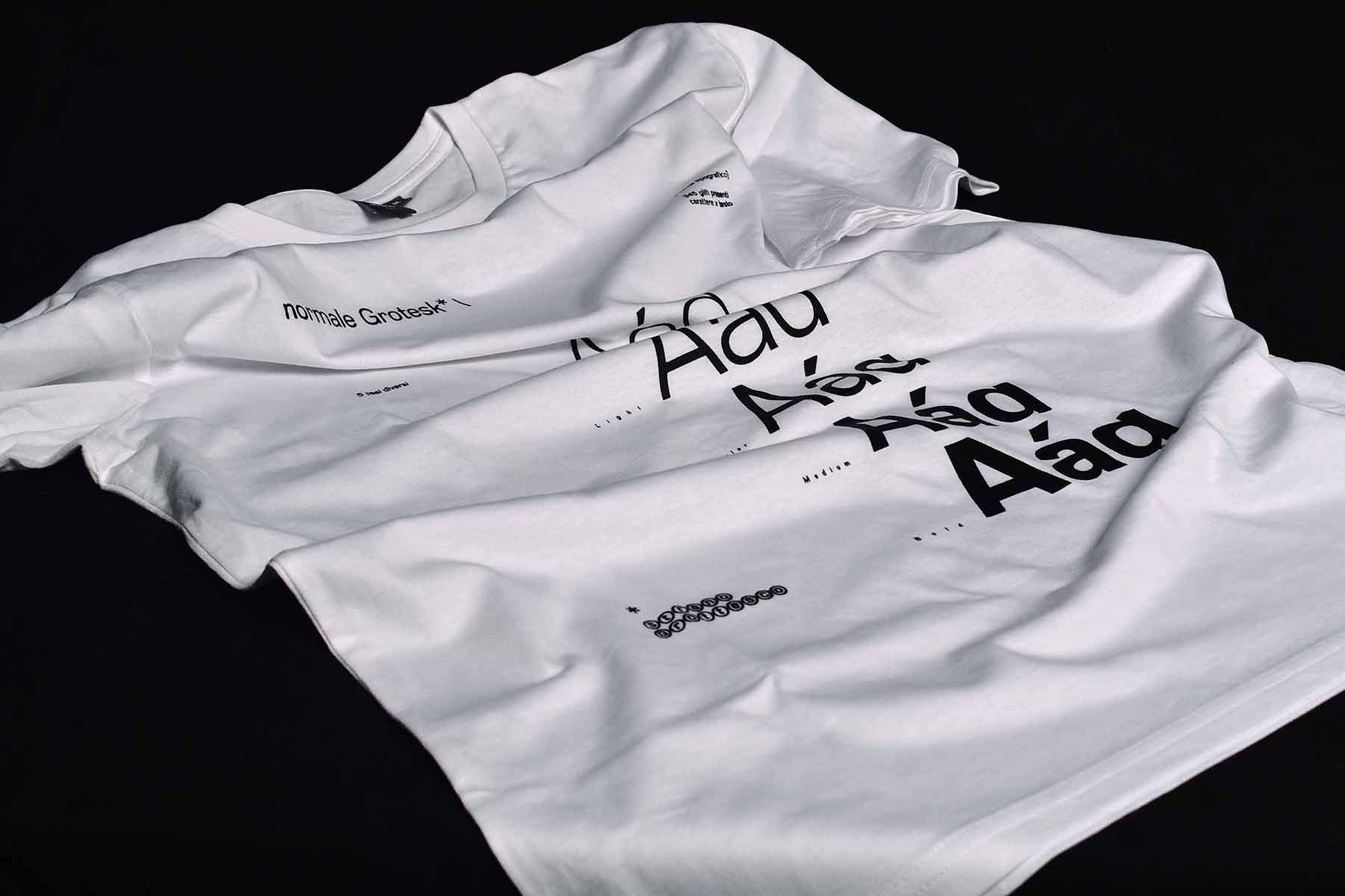
Normale Grotesk è un font progettato per funzionare al meglio in un corpo di testo che va dai 6 ai 14 punti. Infatti, nonostante l'altezza ridotta delle lettere, è facilmente leggibile. Anche se la funzione originale di questo tipo è quella di essere utilizzato per piccoli testi, può anche essere adattato ai corpi di visualizzazione. Questa caratteristica lo rende versatile e applicabile a una varietà di media e contesti. Questo lavoro è stato prodotto come progetto di tesi durante il Bachelor in Comunicazione Visiva alla SUPSI, Svizzera.

Normale Grotesk is a font designed to work best in a text body ranging from 6 to 14 points. In fact, despite the narrow height of the letters, it is easily readable. Although the original function of this type is to be used for small texts, it can also be adapted to display bodies. This feature makes it versatile and applicable to a variety of media and contexts. This work was produced as a thesis project during the Bachelor in Visual Communication at SUPSI, Switzerland.


Poster design per il font Goncia Sans
Dettaglio del carattere tipografico Goncia Sans
Goncia Sans poster design
Goncia Sans poster design ticino
Dettaglio del poster design per il carattere Goncia Sans

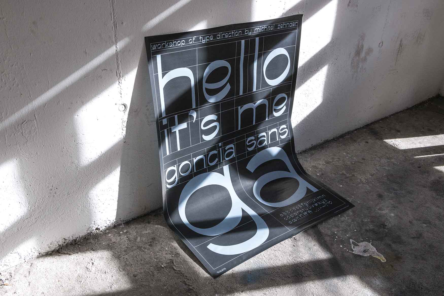
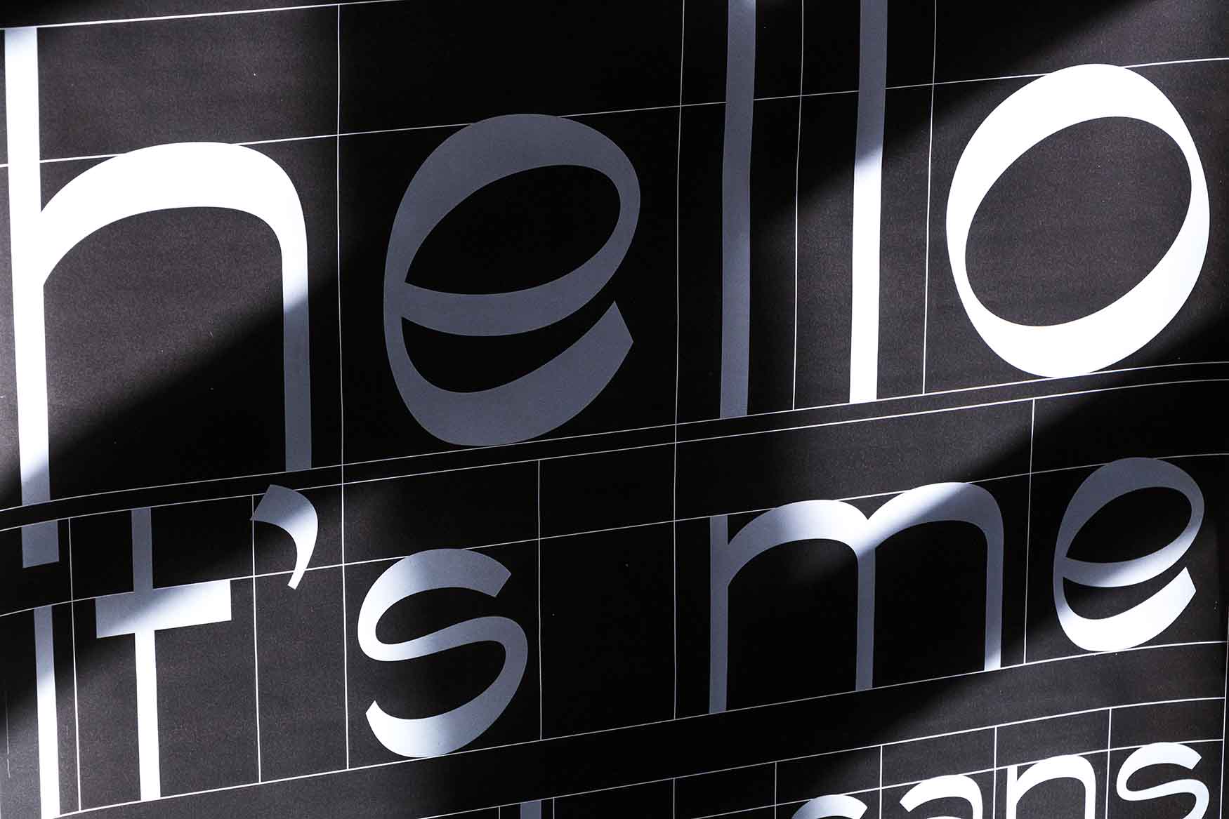
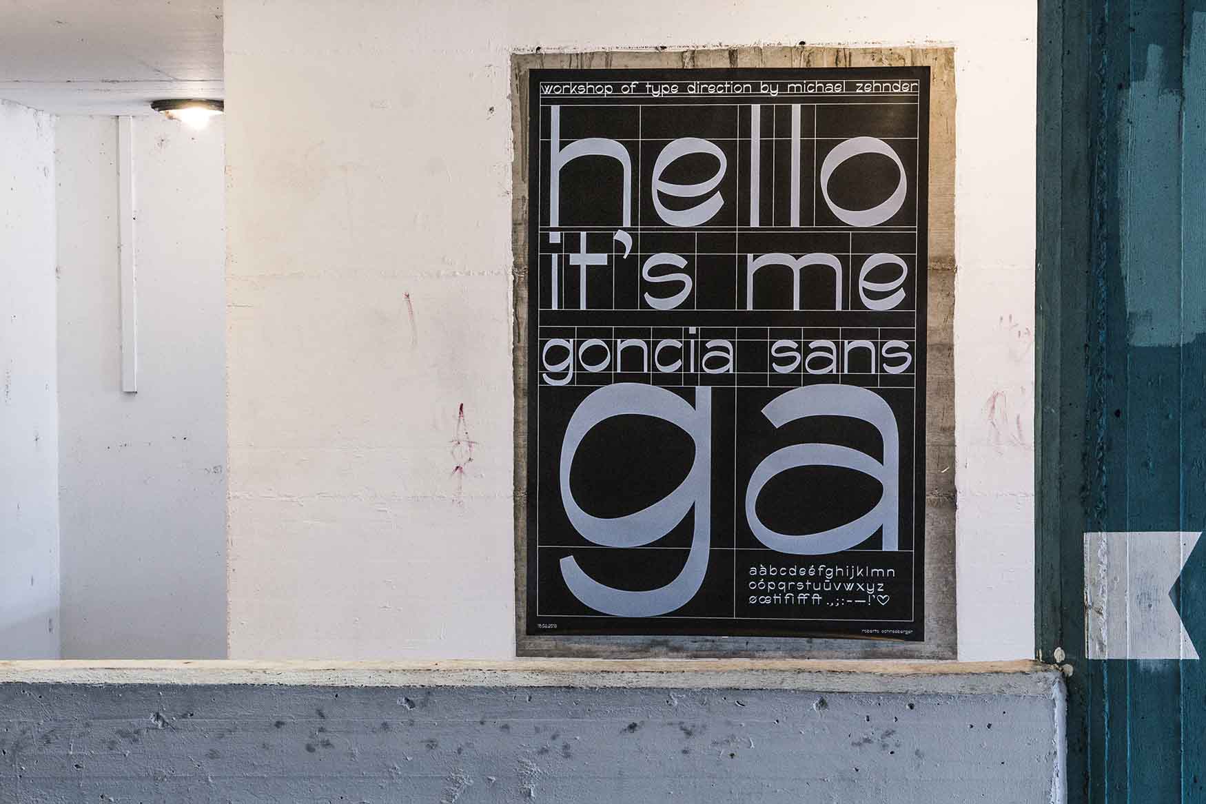
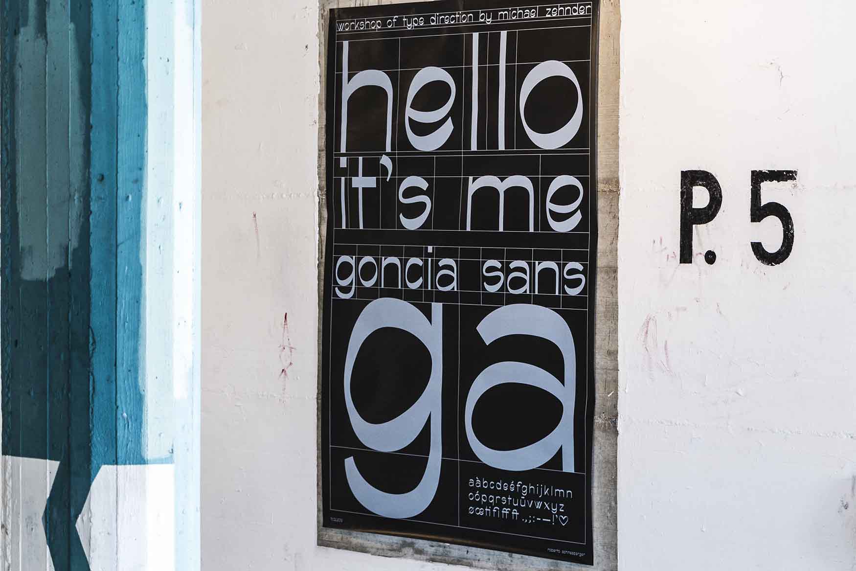
Durante un workshop di type direction di una settimana con Michael Zender dello studio Africa, è stato progettato un carattere tipografico ispirato alle forme e alle caratteristiche della scrittura sociale.

La parola onciale descrive un preciso tipo di scrittura che si sviluppò tra il III e il IV secolo dell'era cristiana ed era la scrittura per eccellenza dei manoscritti miniati, più adatta alla penna e alla pergamena, che sostituì il papiro.

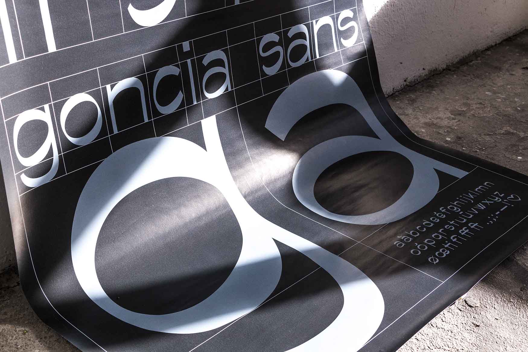
L'onciale latino è caratterizzato dalle sue curve. Ispirandosi alle aste curve create dal pennino e dall'inchiostro di china, è stato studiato e progettato un font contemporaneo. È caratterizzato da un'evidente differenza di spessore nelle aste, dall'asse obliquo e dalle curve non omogenee.

Dato l'ultimo tempo a disposizione, in questo tipo sono presenti solo lettere minuscole e numeri. Per evidenziare le caratteristiche, far risaltare il carattere e presentarlo alla commissione, è stato progettato un esemplare di poster F4.

During a week-long type direction workshop with Michael Zender from studio Africa, a typeface inspired by the shapes and characteristics of social writing was designed.

The word onciale describes a precise type of handwriting that developed between the 3rd and 4th centuries of the Christian era and was the writing par excellence of illuminated manuscripts, better suited for pen and parchment, which replaced papyrus.

The Latin onciale is characterized by its curves. Inspired by the curved rods created by the nib and the Indian ink, a contemporary font has been studied and designed. It is characterized by an evident difference in thickness in the rods, the oblique axis and the non-homogeneous curves.

Given the last time available, only lowercase letters and numbers are present in this type. To highlight the characteristics, make the font stand out and present it to the commission, a specimen F4 poster has been designed.


Interaction Design

Codly applicazione per il gioco in realtà aumentata
Shapies AR tesi Artur Strupka gioco in realtà aumentata
Augmented Reality Game Shapies AR

Shapies AR è un gioco educativo in realtà aumentata progettato per essere utilizzato nelle scuole primarie da bambini e insegnanti. Il gioco permette ai bambini di immergersi nella realtà aumentata e di scoprire argomenti legati alla tecnologia e alcuni concetti legati al pensiero computazionale attraverso il gameplay. Gli insegnanti possono utilizzare l'applicazione per supportare le loro lezioni sulla tecnologia, introducendo argomenti interessanti in linea con la società di oggi. Gli argomenti possono essere introdotti in diverse materie scolastiche e il gioco si integra nell'insegnamento con la possibilità di creare specifiche attività di apprendimento. La realtà aumentata è una tecnologia all'avanguardia che permette ai contenuti digitali di interagire con il mondo reale e creare esperienze uniche per i bambini, che possono immergersi nella scoperta di un mondo digitale aumentato.

Questo progetto è stato finanziato dalla Fondazione Leonardo e sviluppato come lavoro di tesi per il Master in Interaction Design alla SUPSI, Svizzera. Con il supporto dei consulenti: Serena Cangiano, Lorenzo Romagnoli e Lucio Negrini.

Shapies AR is an augmented reality educational game designed to be used in primary schools by children and teachers. The game allows children to immerse themselves in augmented reality and discover topics related to technology and some concepts related to computational thinking through the gameplay. Teachers can use the application to support their lessons on technology, introducing interesting topics in line with today’s society. The topics can be introduced in different school subjects and the game integrates into the teaching with the possibility to create specific learning activities. Augmented reality is a cutting-edge technology that allows digital content to interact with the real world and create unique experiences for children, who can immerse themselves in the discovery of an augmented digital world.


This project was funded by the Leonardo Foundation and developed as a thesis work for the Master in Interaction Design at SUPSI, Switzerland. With the support of the advisors: Serena Cangiano, Lorenzo Romagnoli and Lucio Negrini.

Codly project augmented reality game for kids
Codly dettaglio interazione di gioco
Spider plotter immagine oggetto
Dettaglio del progetto Spider Plotter
Interazione con l'oggetto
Dettaglio sul taglio laser
Dettaglio sul oggetto

Spider Plotter è un progetto scolastico di gruppo realizzato al Master in Interaction Design durante il corso: Creare Interfacce Tangibili con l'insegnante Ubi De Feo. Un video del progetto può essere trovato qui.

Lo Spider Plotter è simile al Vertical Labyrinth nel senso che è un gioco verticale e richiede l'interazione dell'utente per tracciare o navigare attraverso un labirinto. Ha solo due pulsanti - il pulsante on/off e il pulsante di reset. Il corpo del plotter ha un sensore TOF su entrambi i lati. I sensori controllano due motori che possono ruotare in senso orario e antiorario per muovere la testa del plotter, che ha una penna collegata ad essa. La capacità dei due motori di muoversi in entrambe le direzioni è ciò che controlla il movimento della testa del plotter. La penna che è posizionata al centro della testa del plotter, disegna lungo la tela mentre la testa del plotter si muove. Lo Spider Plotter si distingue per lavorare interamente senza alcun contatto fisico. Tutto quello che l'utente deve fare è avvicinare o allontanare le mani dal sensore su entrambi i lati del corpo, e la testa del plotter si muove di conseguenza. Lo Spider Plotter ha una curva di apprendimento intuitiva, dove gli utenti possono capire come giocare con esso senza molte istruzioni precedenti.

Spider Plotter is a group school project realized at the Master in Interaction Design during the course: Creating Tangible Interfaces with teacher Ubi De Feo. A video of the project can be found here.


The Spider Plotter is similar to the Vertical Labyrinth in the sense that it is a vertical game and requires user interaction in order to plot or navigate through a maze. It has only two buttons – the on / off button and the reset button. The body of the plotter has a TOF sensor on either side. The sensors control two stepper motors that can rotate in clockwise and anticlockwise directions in order to move the plotter head, that has a pen attached to it. The ability of the two motors to move in either direction is what controls the plotter head to move around. The pen that is positioned at the centre of the plotter head, draws along the canvas as the plotter head moves around. The Spider Plotter sets itself apart by working entirely without any physical contact. All the user has to do is move their hands closer or further away from the sensor on either side of the body, and the plotter head moves accordingly. The Spider Plotter has an intuitive learning curve, where users can understand how to play with it without much prior instructions.

Graphic design | Front-end Development | Brand Identity | Logo design | Marketing | Advertising

X

About

5115 is a design studio based in Locarno (CH) with a strong passion for graphic design and interaction design.
Send us a funny message to
hello@5115.studio